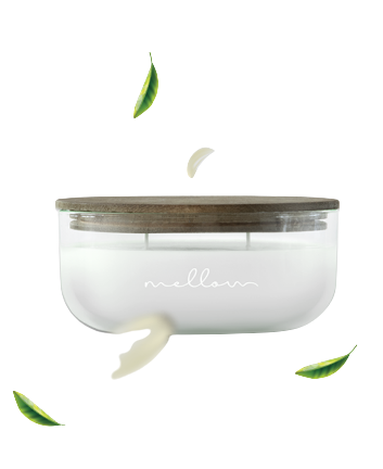
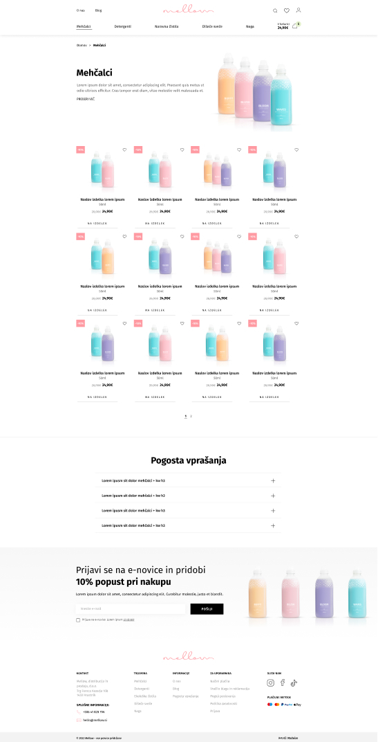
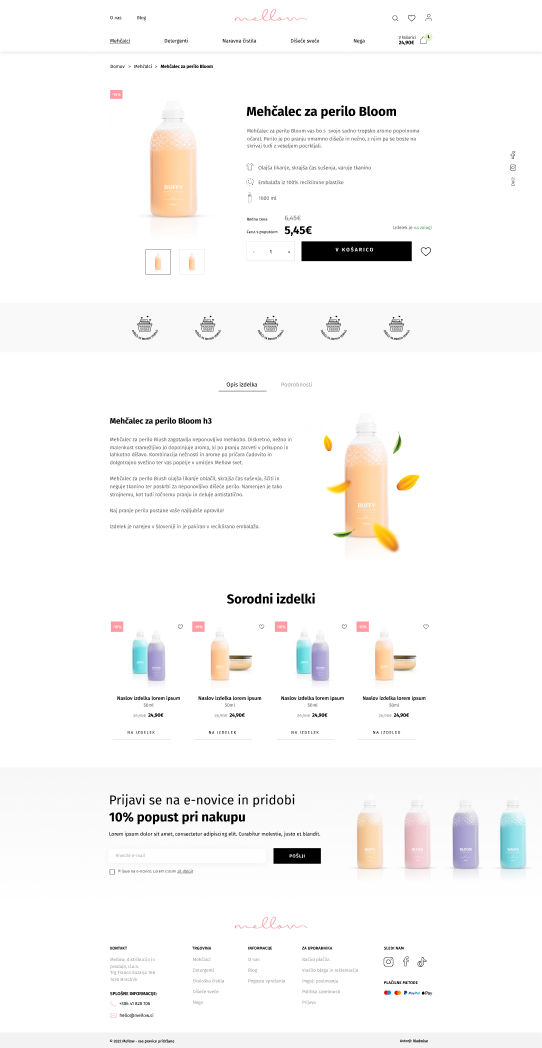
For Mellow, a brand known for its carefully chosen and deliberately designed high-quality products for home, we renovated their web store. The trendy and clear website helps users to browse the incredibly aromatic world of Mellow products easily.
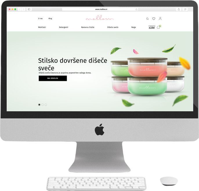
Design preparation and web store development
The brand Mellow impresses with its lines of stylistically perfected scented candles, eco-friendly cleaning products, fabric softeners, body care products, and laundry detergents. The main goal of the web store renovation was to upgrade the user experience (UX) as it was inadequate. Additionally, the previous web store had been missing some functionalities that would make it easier for the client to edit the platform and for the users to go through the buying process.
Renovation of the web store
Modern and minimalist design
Perfected UX and UI
Integrated with the marketing automation platform
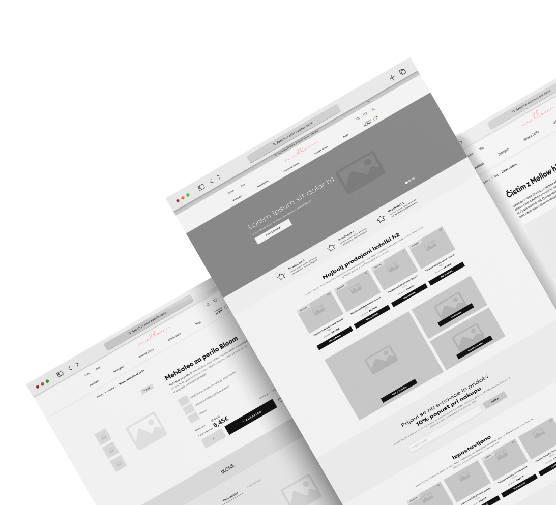
Carefully chosen modules and image preparation
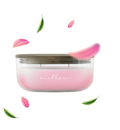
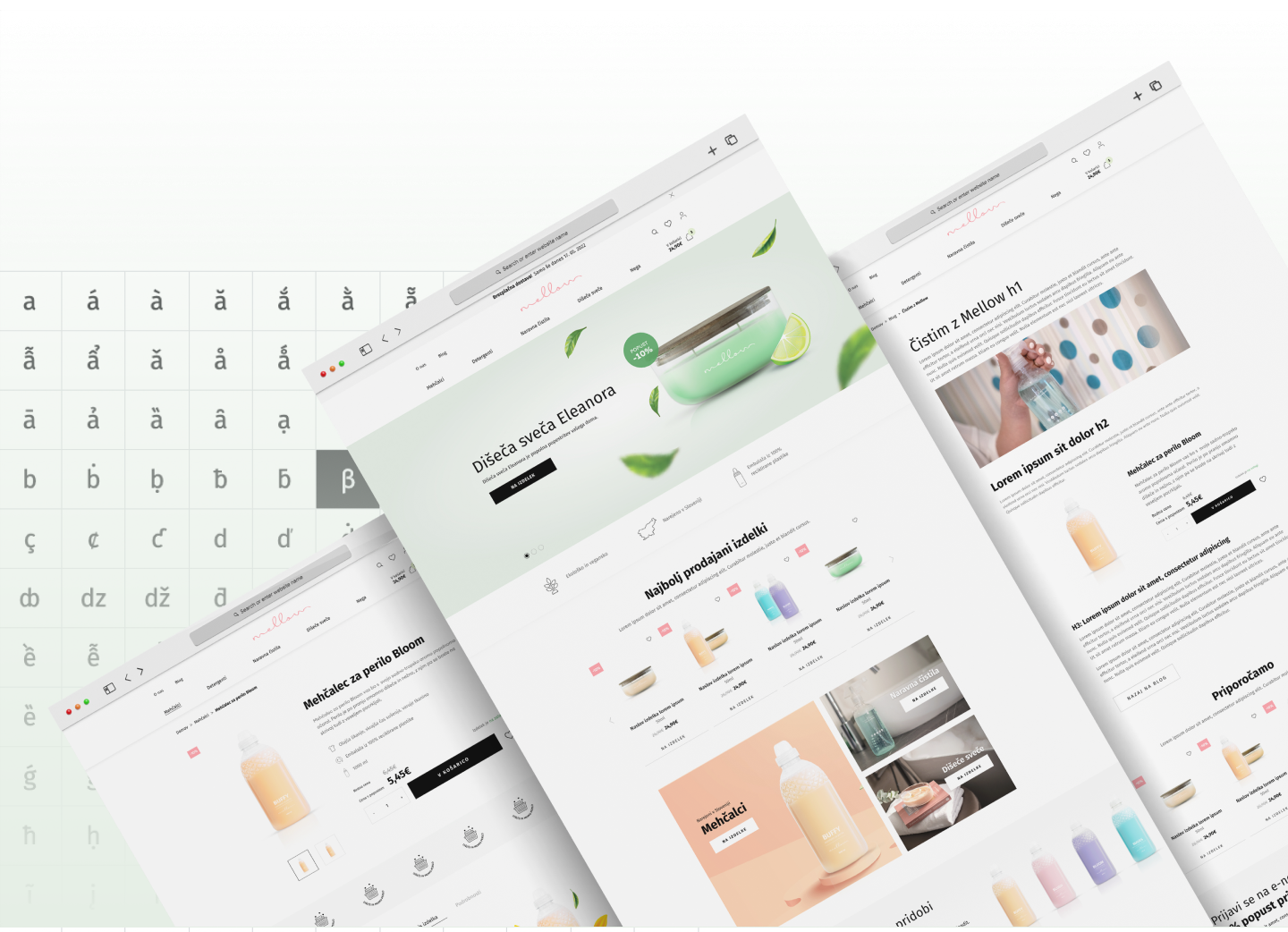
When renovating the web store, we decided to expose Mellow products and emphasize their main advantages, so that the users would identify with them more easily. In the development phase, we designed wireframes and implemented graphic elements as a new manner of communication. These elements are also used for marketing purposes. With their aid, the page reflects the main values of the brand - clean, aromatic, pleasant, and relaxing.


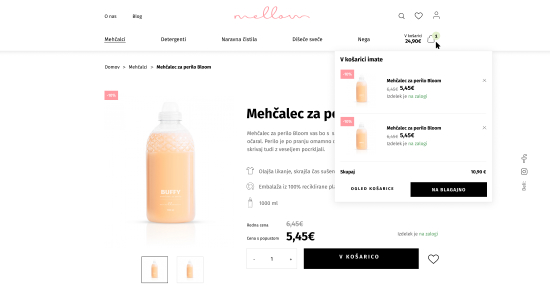
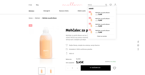

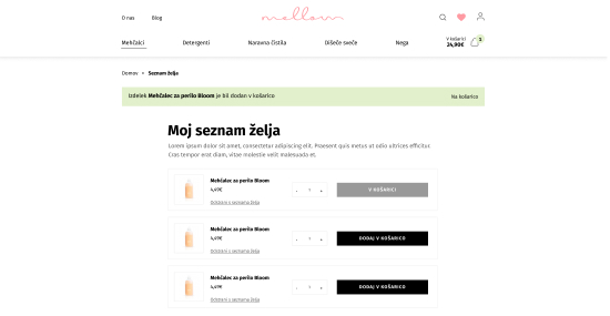
A fast and easy purchase - everything in one place
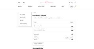
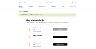
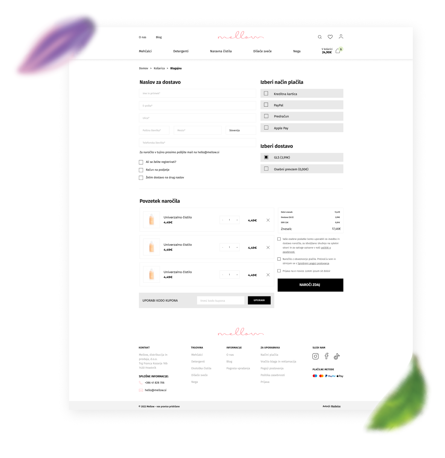
The whole purchase procedure is extremely easy for the user. It enables them to register and create an account, with which they also get the opportunity to get special benefits. Next to that, they can also make a purchase without registering and can buy as a guest.
The purchase is done in one simple step, enabling the user to check all the data before ordering. In the cart preview (and in the cart itself), the user can also see the amount of money needed to get free delivery or what the minimal sum for ordering is.

“The decision to entrust Madwise with the renovation of our web store turned out to be a bullseye. Their technical knowledge and support are on a really high level where everything works in a way one can only desire. They are fast and responsive, which is very important for us, smaller e-sellers, as sometimes complications occur that needed attention “yesterday”. Our wish was to be wowed by the design and already the first drafts did exactly that. That convinced us even more that we had made the right move by choosing Madwise.“
The implementation of complete technical solutions
We also made sure that the website has optimal SEO fundamentals. Already during the process of planning and preparing the wireframe for the website, the SEO experts did a thorough keyword research and prepared a proposition for the most optimal SEO navigation, SEO mobile-view suggestions, and an overview of the content elements that are needed for an effective web store. A complete on-site technical analysis was also conducted, together with all technical SEO and content elements needed for going live with the web store.
We integrated the website with the accounting system and enabled the client an easy platform management. We also provided integration with the GLS app, enabling the client to print labels fast and the users to track their packages. Also, various payment modules were implemented (Stripe and PayPal).
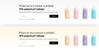
The web store is also connected to the marketing automation software. Together with the web store’s system emails they represent the automatic system for customer notifications. Automatic emailing flows have been implemented, for example, reminders for unpaid pro forma invoices, and offers with various promotional codes.
Before going live with the web store, a stress test was conducted, with which we made sure that the published website would and will be stable when visited by more than 300 users at the same time.
Our clients’ opinions
We create remarkable things with remarkable partners.


